Hi, I embedded my appsmith app into an external html page but now my app isn’t anymore responsive, there is a fix to this ?
@toninom Sorry you are facing an issue. Could you provide some more details? Is the app working independently and only not working when embedded? Are there any errors you are seeing on Appsmith or on the Console? If possible could you share screenshots of the same so that we can help troubleshoot the issue? Thanks

Can you share the width / height you are providing in the iframe tag?
height=“1100” width=“100%”>
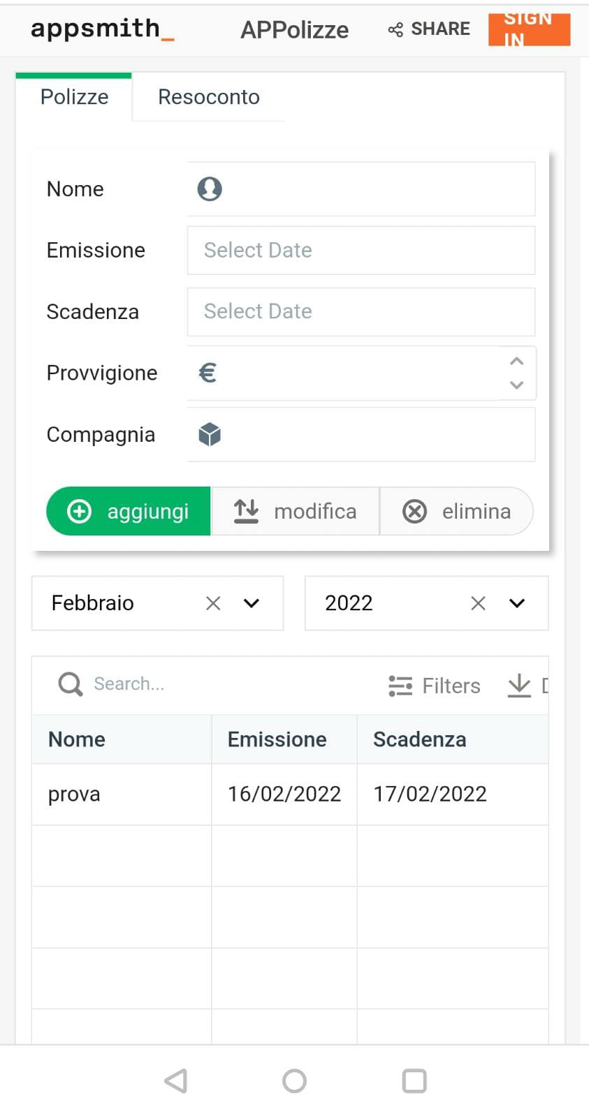
Yes it is, the other photo is from the same app accessing it directly by the appsmith link and not by the embedded page
@toninom I understand what you are saying. I was able to reproduce the issue. App looks fine in different devices when using fluid width mode. but when you embed the app, it stretches.
This should probably get solved with this feature - https://github.com/appsmithorg/appsmith/issues/4630
Still let me check with the team and confirm
@toninom We have created separate issue for this. You can track it here - [Bug]: Mobile responsiveness not supported in fluid width when app is embedded in iframe · Issue #11363 · appsmithorg/appsmith · GitHub
@toninom Hey, we looked into this issue and we think it can be resolved by you adding the following line to head
<meta name="viewport" content="width=device-width, initial-scale=1">
Could you try and see if this works for you?